Low level plotting function to add range of observed values to time series plots.
Source:R/plot-add-range.R
plot_add_range.RdThis function can be used to add the range of observed data to a timeseries plot
generated with plot_line. The density of the color gives an indication
of the likelihood of the value.
See also
Other low-level-plot functions:
plot_add_box()
Examples
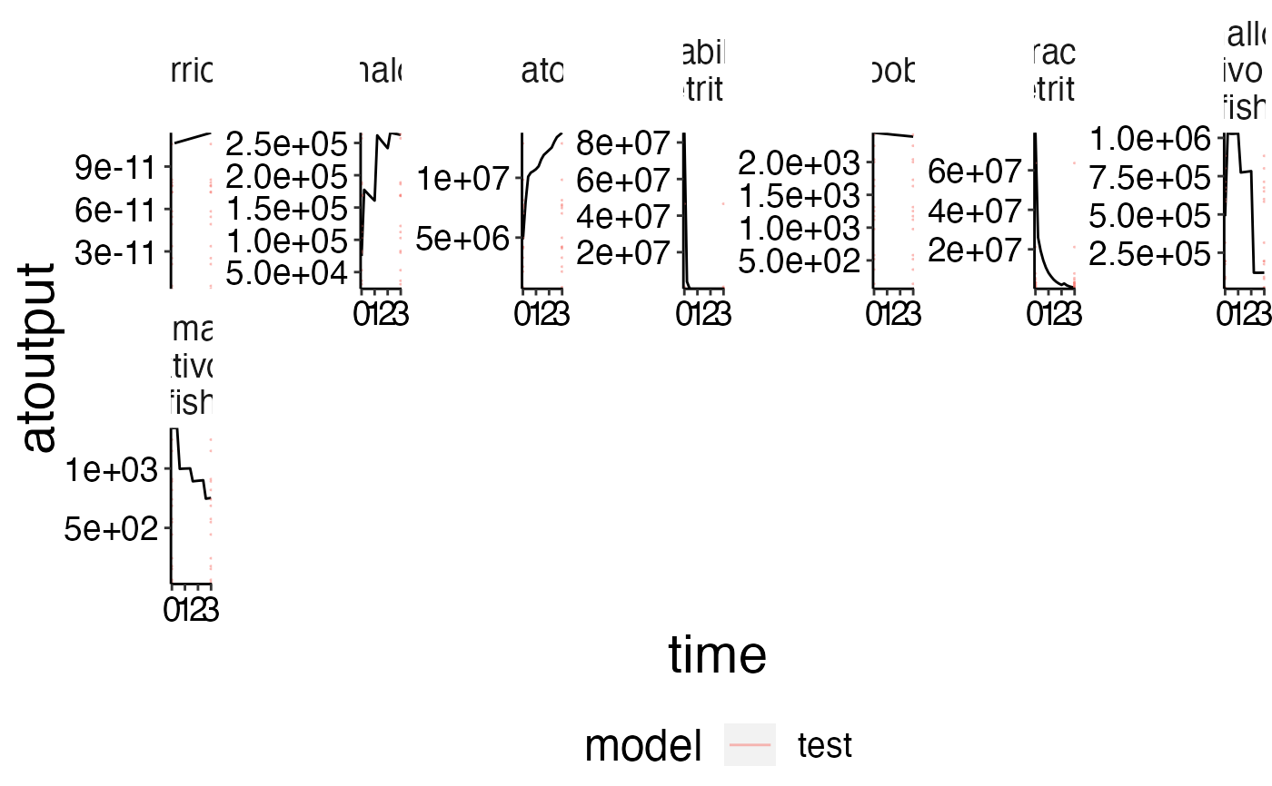
# There is no external data so we need to add some noise first!
ex_data <- preprocess$biomass
ex_data$atoutput <- ex_data$atoutput * runif(n = nrow(ex_data), 0, 1)
ex_data$model <- "test"

# Create the timeseries with \code{\link{plot_line}}
plot <- plot_line(preprocess$biomass)

# Add the external data as geom_rug with \code{\link{plot_add_range}}
plot_add_range(plot, ex_data)