Function to plot relative contribution of biomass and numbers per cohort.
Source:R/plot-bar.R
plot_bar.RdFunction to plot relative contribution of biomass and numbers per cohort.
See also
Other plot functions:
plot_boxes(),
plot_diet(),
plot_line(),
plot_rec(),
plot_species()
Examples
plot_bar(preprocess$biomass)
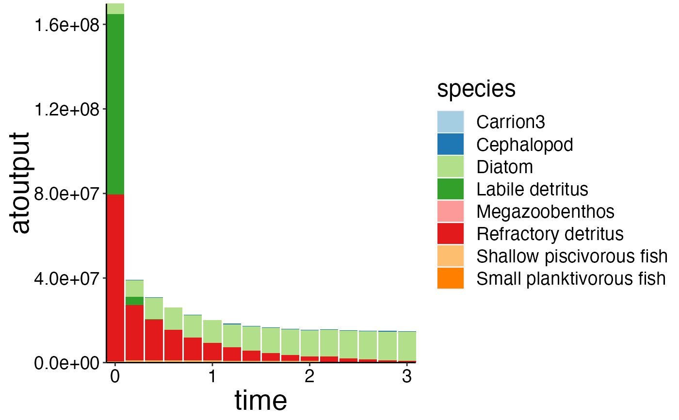 # Most models have a large number of groups. Please make sure to combine groups with a low
# contribution prior to plotting with \code{\link{combine_groups}}.
df <- combine_groups(preprocess$biomass, group_col = "species", combine_thresh = 3)
#> Joining with `by = join_by(species)`
#> Joining with `by = join_by(species)`
plot_bar(df)
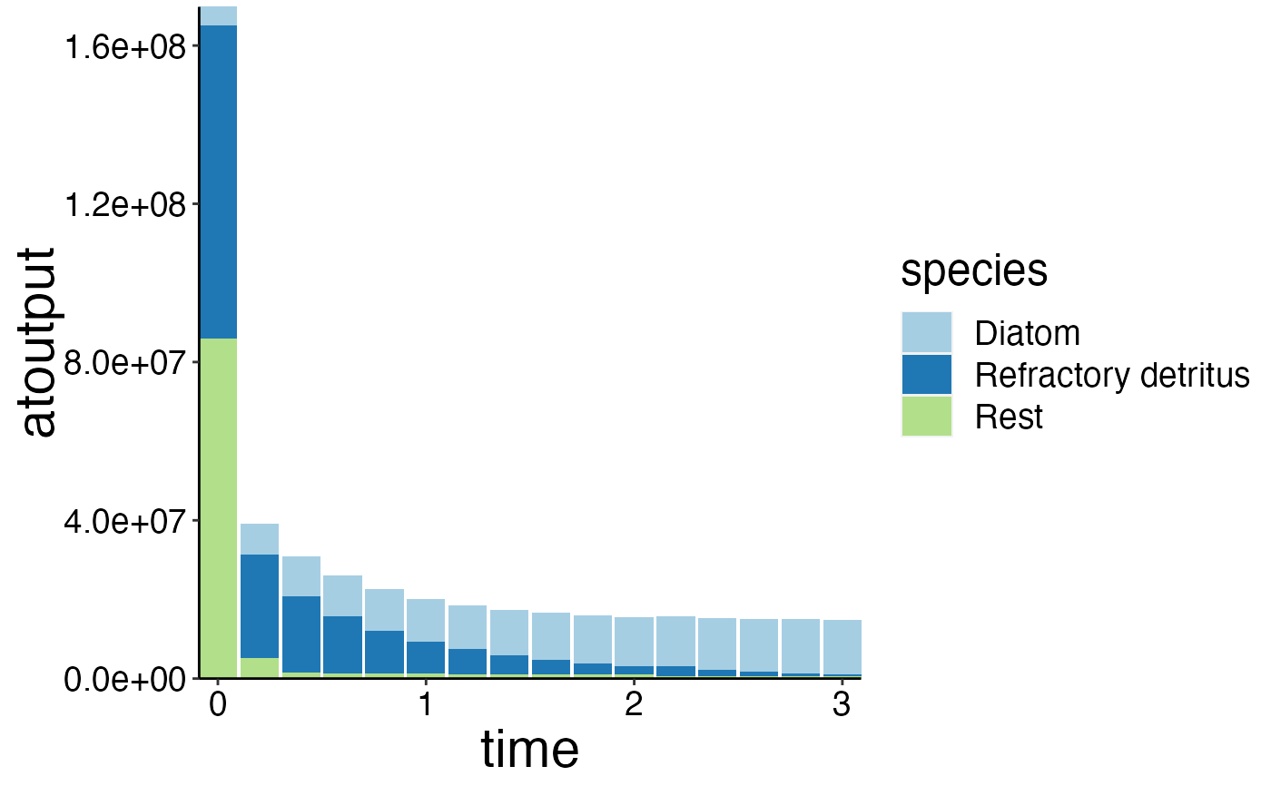
# Most models have a large number of groups. Please make sure to combine groups with a low
# contribution prior to plotting with \code{\link{combine_groups}}.
df <- combine_groups(preprocess$biomass, group_col = "species", combine_thresh = 3)
#> Joining with `by = join_by(species)`
#> Joining with `by = join_by(species)`
plot_bar(df)
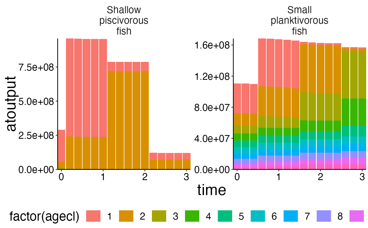
 # This function can also be used to plot age-specific data.
plot_bar(preprocess$nums_age, fill = "agecl", wrap = "species")
# This function can also be used to plot age-specific data.
plot_bar(preprocess$nums_age, fill = "agecl", wrap = "species")
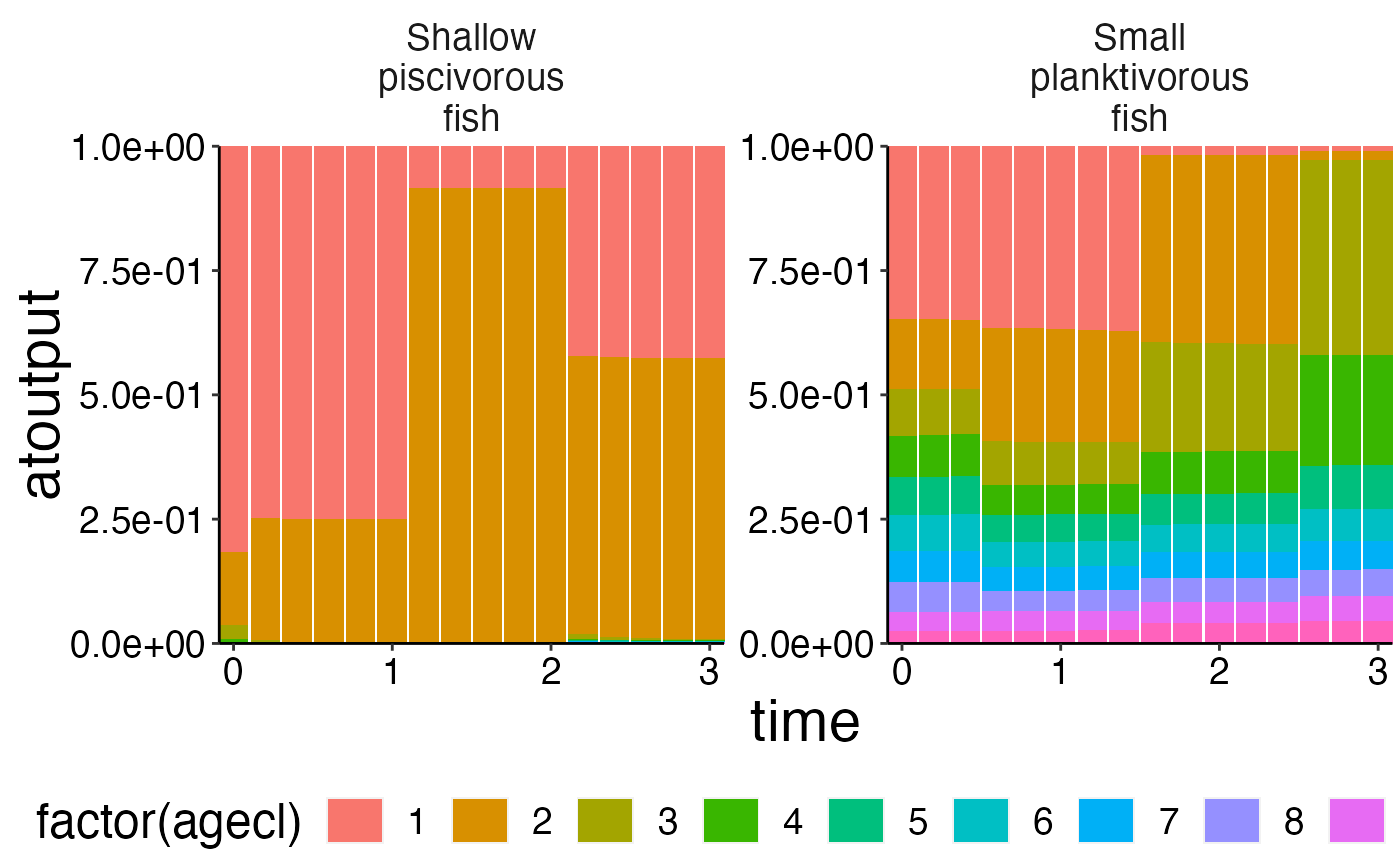
 # Please use \code{\link{agg_perc}} to visualize the relative cohort structure over time.
df <- agg_perc(preprocess$nums_age, groups = c("time", "species"))
plot_bar(df, fill = "agecl", wrap = "species")
# Please use \code{\link{agg_perc}} to visualize the relative cohort structure over time.
df <- agg_perc(preprocess$nums_age, groups = c("time", "species"))
plot_bar(df, fill = "agecl", wrap = "species")